Hands On Review: Wacom Inkling
8 Dec, 2011I wasn’t the only one who knew that I had to get my hands on the Wacom Inkling after seeing this well produced product demo video:
Fortunately for me, after a longer wait than expected (the Inkling was originally going to be released in mid-October; it arrived the first week of December) I got my hands on the new gadget. Here are my very preliminary thoughts after using it for less than 24 hours:
Unboxing
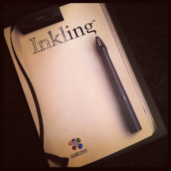
The Inkling arrives in a very elegantly designed package. Clearly inspired by the simplicity of Apple products, the packaging and hardware design are streamlined and well considered. Branding is strongly communicated through the aesthetic, as are instructions for set up and use. At first blush, the device makes a great first impression.

First Use
Packaging aside, the true test is how well it actually works. The thing that really attracted me to the product was the easy transition from sketchbook to digital. I often take sketch-notes, draw interfaces & wireframes, and doodle other creative ideas. The thought of being able to take the best of those notebook drawings and import editable digital copies into Photoshop is exciting.
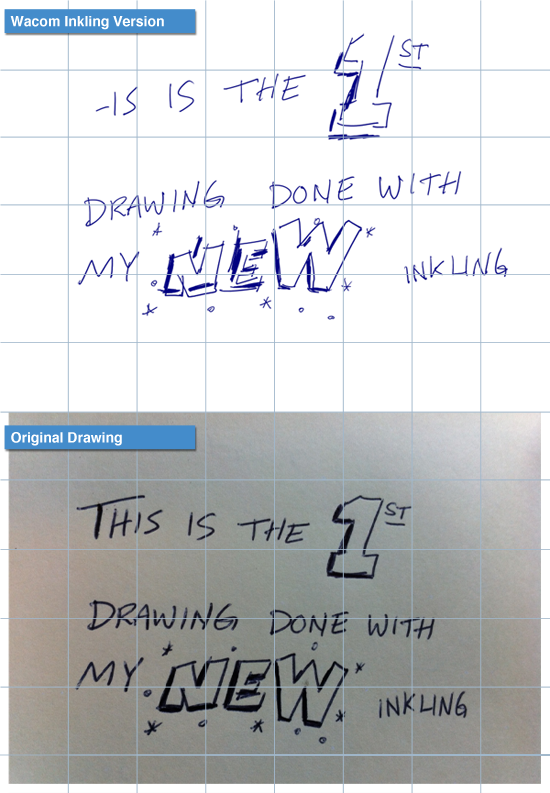
I installed the small battery into the pen, charged the receiver, and in less than an hour created my first sketch. After installing the software that reads the sketch (sketch files are a proprietary filetype—not a PNG or JPG), I imported the drawing into Photoshop. The image wasn’t perfect, but it did a decent job capturing the spirit of my drawing.
Then I took a photo of my sketch to perform a more detailed comparison. As you can see in the image below, many elements of the original sketch are out of alignment compared to the digital rendering.

Early Verdict
The misalignment is cause for concern for me. As I mentioned, I was hoping to use this tool to translate early sketches of user interface designs into an editable digital format. If the angle and placement of lines skews in the digital copy, the UI will look off. I’ll have to spend more time editing the digital version to align to my original vision. The misalignment issues would obviously be a cause for concern for illustrators as well.
I was also surprised that the digital version of the drawing appears with blue lines. The pen draws in black, and all of the branding—from the video to the packaging show black inked sketches. It’s a fairly simple tweak to adjust the color in Photoshop, but I’m curious why it comes out blue in the first place. (Hopefully, there’s a setting I haven’t discovered yet where I can change the default ink color to black.)
So, I’m going to keep playing with it. Hopefully, I can get better results through more experimentation. Those of you who are drooling over the Inkling may want to hold off just a bit. Read a few more reviews, and check back in with me to see how it’s working after another week or so. For $200, I can’t strongly recommend running out and buying one right away.
Posted in Design, Technology | Comments Off on Hands On Review: Wacom Inkling