A Fresh Redesign 2012: A Responsive Approach
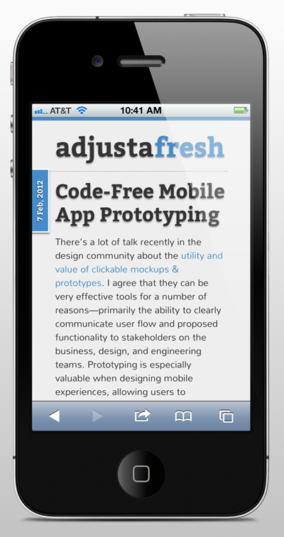
23 Feb, 2012Seeing as I’ve transitioned into a position that focuses exclusively on mobile user experience and interface design, I thought it was only appropriate to tackle a more mobile-friendly (i.e. adaptive, fluid, responsive, progressive enhancement, etc.) redesign for my own site. I thought I’d share a bit on the process and nuts & bolts behind the transition.
Design Documentation
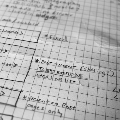
I started with jotting down some requirements and high-level sketch wireframes (basically labeled rectangles) of various screen orientations and layouts. My priority was simplifying the design—get out of the user’s way in order to make it easy for them to consume and interact with the content on any device, and cut anything superfluous (advertisements, NASCAR sharing buttons). I also wanted it to be easier for me to compose short form content in order to get back into the habit of writing shorter posts more frequently.

Design & Construction
After I had a clear sense of what I wanted, I did a bit of research on responsive design frameworks. I ended up considering The 1140px CSS Grid and Less Framework, ultimately choosing Less. I prefer the Less Framework because it’s super light-weight and really just gets out of your way. There’s no need for a bunch of custom classes and containers. The screen scales and the CSS adjusts accordingly… easy peasy.
The site was hand-coded by me. HTML5, CSS3 and custom WordPress integration. I know it works in Chrome & Safari. I’ll get around to browser testing in Firefox soon. I guess I should make sure it’s acceptable in the latest version of Internet Explorer at some point.
I also used Google Web Fonts for the typography. We’ve come such a long way in the web typography department. No more limited font choices (choose Times, Arial or Verdana), crazy CSS image hacks, or using Flash (remember sIFR?). Again, easy peasy.

I also opted to use Disqus as the comment engine for the blog. I like the single sign-on aspect of it. It’s also mobile friendly (with zero customization on my part).
Interestingly, (to me, anyway) I never mocked up the design in Photoshop. Normally, I would have created some screen designs and then sliced up graphics to apply to the CSS. The entire design was created in the browser with HTML & CSS. I used Photoshop only to create the button icons in the Category navigation. It’s the only background image (non-content image) in the entire design. I think that’s a good thing.
So that’s it for the most part. It’s not completely finished; there are some tweaks and finishing touches that I still need to make. But all-in-all, I’m pleased with the initial release. I’d love to hear any questions or feedback on the redesign!
Posted in Design, Mobile, User Experience | 2 Comments »
-
JMillerBoston
-
http://www.adjustafresh.com/ Scott Kiekbusch