iOS7, Ergonomics, and Moving The Trash
23 Aug, 2013I’ve been using iOS7 on an iPhone 5 for several weeks now. With each Beta release there have been modifications to stabilize and improve the operating system. I have concerns about usability issues, especially for users who are new to the iPhone experience, but for the most part—aside from some stylistic choices and visual design inconsistencies—the new operating system is a step in a positive direction.
There’s one thing that’s been bother me though…enough to blog about it. Apple moved the Trash!
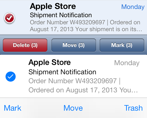
The image above features 2 versions (iOS6 on top & iOS7 on the bottom) of a selected email directly on top of the bottom row of the iOS email application. The bottom row appears after the user taps the “Edit” button in the upper-right corner of the interface allowing them to select multiple emails to delete, move to another folder, or mark as read/unread.
The three actions available along the bottom are clearly interactive in the iOS6 version due to the graphic design depicting buttons. Another point of interest is the “Delete” button is red in iOS6, most likely to indicate this is a more serious action (i.e. harder to undo) than moving or marking emails. Additionally, the number of emails selected to delete, move, or mark also appear in the button.
iOS7 removes the skeuomorphic buttons, replacing them with only words/labels which may confuse novice users about whether these are interactive. The word “Delete” has been replaced with “Trash” which is an interesting change since trash is more recognizable as a noun rather than an action. The red indicator and numbers have also been removed.
Most importantly (to me anyway), the delete/trash action has been moved from the lower-left corner of the screen to the lower-right corner. Early versions of the iOS7 Beta had the button on the left, but it was recently (and deliberately) moved. I’m right-handed, as are the majority of mobile users, and as such I tend to hold the device in my right hand, frequently deleting multiple emails via the “Edit” button.
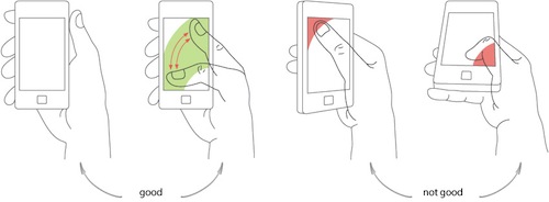
As you can see from the diagram above, moving the thumb from the upper-right (“Edit” button) to the lower-left (“Delete/Trash” button) is an easy, ergonomically correct gesture. Moving from the upper-right to the lower-right is uncomfortable and actually causes physical strain to the hand and thumb. Basically, for such a common action, the lower-right is the worst possible location for the email delete action.
Apple, please put the delete action back on the left side. Perhaps even consider making an option in settings for left vs. right-handed users. Given the number of emails I select and delete on a daily basis, I’m bound to end up with a repetitive strain injury in my thumb if the action stays on the bottom right side of the screen.
Posted in Design, Mobile | Comments Off on iOS7, Ergonomics, and Moving The Trash